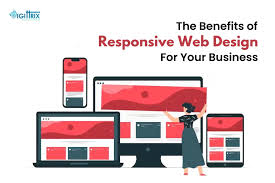
In this modern world, your website is the face of your business. It’s the place where potential customers learn about your products, services, and brand identity. But here’s the catch: not all visitors access your site from the same device. Some may use a desktop, others a tablet, and most are likely browsing on a mobile phone.
This is where responsive web design (RWD) comes in. A responsive website adapts seamlessly to any screen size or device, offering an optimized experience for all users. More than just a design trend, responsiveness has become a business necessity. Companies that ignore it risk losing customers, while those that embrace it can enjoy stronger engagement, higher conversions, and sustainable growth.
In this blog, we’ll explore what responsive design is, why it matters, and how it can fuel your business growth.
What is Responsive Web Design?
Responsive web design is an approach to creating websites that automatically adjust to the user’s screen size and orientation. Whether someone visits your site on a 6-inch smartphone or a 27-inch desktop monitor, the layout, images, and text remain user-friendly.

The concept relies on three core principles:
- Fluid Grids – Content is organized in flexible grids that resize proportionally.
- Flexible Images – Visuals scale appropriately without breaking the design.
- Media Queries – CSS rules that apply different styles based on the device’s screen size.
In short, responsive design ensures one website works for everyone—without the need to build separate desktop and mobile versions.
Why Responsive Design is No Longer Optional
1. Mobile Traffic Dominates
According to Statista, more than 58% of global web traffic comes from mobile devices. If your site doesn’t look good or function properly on a smartphone, you’re automatically alienating the majority of your audience.
2. Google Prioritizes Mobile-Friendly Sites
Since Google’s mobile-first indexing update, responsive websites rank higher in search results. Poor mobile experiences, on the other hand, lead to lower visibility and fewer organic visitors.
3. User Expectations Have Changed
Modern customers expect fast-loading, easy-to-navigate websites. If your site frustrates them with pinch-zooming or broken layouts, they’ll quickly leave—and possibly choose a competitor.
How Responsive Web Design Boosts Business Growth
1. Improves User Experience (UX)
User experience is the foundation of digital success. A responsive website ensures visitors can browse effortlessly, read clearly, and interact smoothly, regardless of device. That is why having a good UI/UX is important for a website to perform good.
When users feel comfortable, they stay longer, explore more pages, and are more likely to convert into paying customers.
Example: An e-commerce store with responsive design allows shoppers to browse products, zoom in on images, and complete checkout seamlessly on mobile. This reduces cart abandonment and increases sales.
2. Increases Conversion Rates
A responsive design eliminates barriers between your website and potential customers. Calls-to-action (CTAs), forms, and buttons are always visible and functional.
According to Google, 61% of users are unlikely to return to a site if they had trouble accessing it on mobile—and 40% will visit a competitor’s site instead. By ensuring a smooth journey, you’re more likely to capture leads, inquiries, and purchases.
3. Strengthens Your Brand Image
Your website reflects your professionalism. A poorly optimized site can make your business look outdated or unreliable. On the other hand, a sleek, responsive design signals innovation, trustworthiness, and attention to customer needs.
Think of it as a digital storefront: would you rather enter a shop that’s clean, welcoming, and easy to navigate—or one that feels messy and disorganized?
4. Improves SEO and Online Visibility
Search engine optimization (SEO) is directly linked to responsiveness. Google rewards websites that:
- Load quickly
- Are mobile-friendly
- Offer intuitive navigation
Responsive design checks all these boxes. The result? Higher rankings, more organic traffic, and increased brand exposure.
5. Reduces Maintenance Costs
In the past, companies built two versions of their websites: one for desktop and another for mobile. Maintaining both was costly and time-consuming.
With responsive design, you only manage one website. This saves development resources, reduces errors, and ensures consistency across all devices—allowing you to focus more on growth strategies.
6. Enhances Social Media Engagement
Most social media traffic comes from mobile apps. If users click your ad or post and land on a non-responsive site, they’ll bounce instantly. A responsive design ensures those visitors have a smooth experience, making them more likely to explore your offerings.
7. Future-Proofs Your Business
Technology evolves quickly. New screen sizes, resolutions, and devices are constantly being introduced. Responsive design prepares your website to adapt without requiring a complete overhaul, giving your business long-term stability.
📧 Email:info@smartwebcarecenter.com
🌐 Visit:www.smartwebcarecenter.com
📍 Location:Opposite Gwarko BNB Hospital


